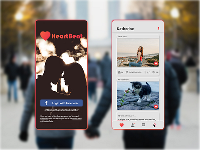
HeartBeat Dating App (Hinge Redesign Concept)

Hey Dribbblers!
Back at it again with a quick redesign inspired by Hinge! The dating app distinguishes itself from other apps by emphasizing more thoughtful and specific matches, with users knowing exactly what part of their profile stood out to someone the most. The current iteration uses a Material Design aesthetic, but I felt that there could be some improvements to better clarify some of the element boundaries.
For this project, I wanted to try implementing the neumorphism/flat design hybrid that I've done in a few projects. While the contrast is a bit subtle, the positioning of the light/dark shadows helps to improve clarity between each card element while making their content pop out more.
Beyond the aesthetic differences, I also wanted to make the app much easier for one-handed navigation. Like Tinder and Bumble, users would be able to swipe left to reject a match, but rather than swiping right to "like" a match, it would be used to revisit the last match. This helps to minimize on-screen prompts while keeping a cleaner look.
What do you guys think of it? Let me know in the comments below, and if you liked it, be sure to hit that "L"!
Want to collaborate or hire me? Contact me at theo.oing@gmail.com!