


Investment App Home Screen


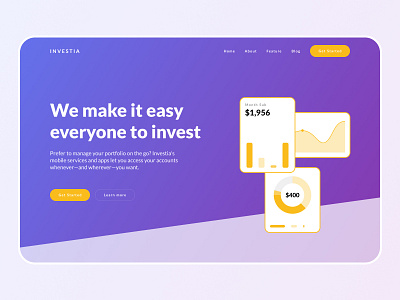
Home Screen for the investment app. Implemented the design based on the client’s brand guidelines. Color scheme gives nice contrast for the CTA elements and point the user’s attention in the right direction.
Font is a classic sans-serif which works well for the investment app. It’s not too formal and a bit playful, which works well for younger audience who want to make their first steps in investing.