


Nimboo Guayusa | Packaging Design

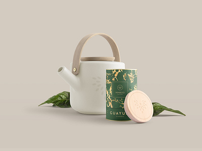
I had the pleasure to design and craft everything from the branding and stationery to the packaging, website, HTML mail signature and social media templates for this fresh new brand. As their main product Guayusa is known for its subtle energy boost, quite literally giving you wings both mentally and physically, I‘ve chosen to craft a „Phoenix“ brandmark made from tea leaves to resemble the „rise from the ashes“ and the brand's origins with tea. Each Product line has got its own custom made organic pattern and decorative elements of which a total of 10 different versions were designed. Within the same product group, each product has their individual colour scheme but uses the same decorative structures, just differently aligned, to create the visual sense of a unified product group, while still making product differentiation to other products of the brand possible, by harnessing a unique structure, pattern and colour palette. Although each product harnesses its individual elements, they all stick to the general packaging design and layout. This gives Nimboo flexibility, structure and aesthetic. Because Nimboo‘s core product „Guayusa“ comes from the Amazon region, the golden structures designed for the product line are based upon the almost vein-like rivers of the Amazon rainforest. For the packaging, a set of custom symbols was designed to support the brewing instruction. A fresh, bold design with a luxurious twist that will certainly set Nimboo apart and lift it up like Guayusa is sure to lift you from your seats.