Analytics Summary Email


Once again, trying to make numbers look less dull...
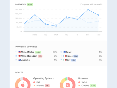
This is a weekly email we're going to send our clients with analytics information about their mobile and Brow.si usage, highlighting the important stuff - the changes between the weekly reports - increments, decrements and new data.
Country flags are the awesome work of GoSquared, god bless them.
Now gotta find a JS charts library to match the design or just develop such :D Any suggestions?
Comments are always appreciated, thanks.