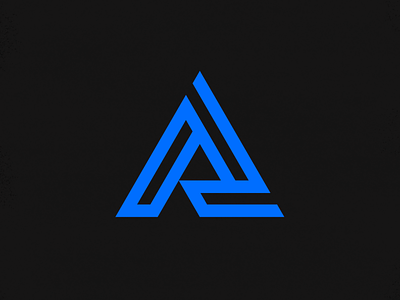
Abracon Rebrand
Excited to share a full rebrand for one of our favorite clients: Abracon. As a leading force in the electronic component industry, they needed a brand that reflects their values and goals, as well as visually bringing them into the 21st century. Though unintentional at first, the mark we landed on ended up being an evolution of their old logo, which consisted of two abstract shapes interlocking. This interlocking conceptually makes a lot of sense for the company, as it touches on several important aspects: Partnerships, technology, and family. The new mark builds on this by interlocking three shapes to create a more balanced "A". The concept of the interlocking shapes is still a very prevalent part of the design, but it also goes a little further. The rotational aspect of the new logo represents Abracon's commitment to constant growth and learning. The sharp corners, along with the check mark created in the shape, allude to the precision and quality that comes with the Abracon experience. The color gets an upgrade with the introduction of the Electric Blue, adding a vibrance and energy that was lacking before. It's also safe to say that everyone was pretty happy to step away from the Stranger Things typeface from the previous logo...


