Hierarchy in Pricing Tiers for Dropbox

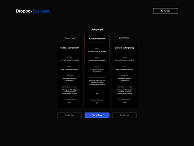

Today's practice is about using hierarchy. I used hierarchy in the size of the middle pricing tier shape, and the red stroke for a different color. I also used a different color font and the blue button to emphasize the middle option even more. The most challenging part of this is having scales of colors that make sense on a dark mode background. For example, the choice to use an almost-black background and then make the cards fully black. I really liked the linear gradient I used for the stroke on the middle card I thought it looked cool.