Screenly
Dribbblers, aaaand ACTION! *Slams clapper board shut* Today we have the #DailyUI challenge number 002.
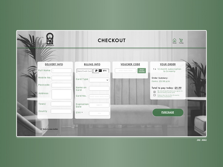
The brief specified: "Design a credit card checkout form or page"
My idea for the checkout page is for a Tv and Movie streaming service named 'Screenly'. - I've gone with a combination of greyscale colours and contrasting them with greens. - As you can see I have kept the checkout page limited to a single page, instead of spreading them over multiple pages with transitions. This simplifies the process for users of all computer proficiencies. This also reduces the load on the host server.
I hope you've enjoyed my take on a payment page! Please, feel free to comment on any improvements that can be made, or even, if you just enjoyed my work.
Many thanks,
JRD