


Orioles Logo Redesign

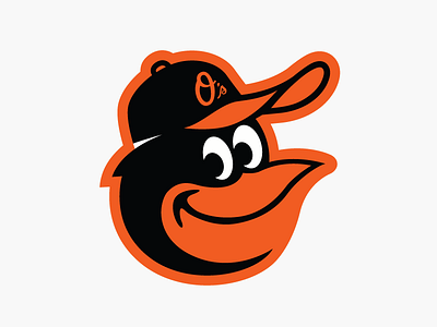
I'm a huge Orioles fan and love the cartoon bird logo. That said, when the new logo was released a couple of years ago, I was disappointed that it fell short in recreating a few key details of the logos from the 70s & 80s, in particular, the Bird's cap.
Thus, in an effort to give my beloved O's the best logo possible, I've redesigned the logo to more accurately capture the essence of the logos of the past.
If you'd like to see more, like the proposal I sent to the O's Director of Marketing, check out my site: http://johnadsit.com/orioles.html