Gold's AMP Branding


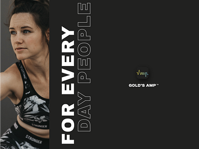
The landscape of fitness apps and tools can be overwhelming, exclusive, and in the end– discouraging. Our brand strategy for Gold's AMP addressed the average end-users pain points by trying to mirror every day life, and everyday people. Keeping the visual identity modern and crisp, and the photography more human and recognizable.