Audiobooks Platform Landing Page

So the task at hand was to design a landing page for an “audiobook streaming app”, and having no experience in using one before I thought I needed to know the core features for such an app. I started researching existing solutions in the market and reading their user reviews.
I found that most of the audiobook users are below the age of 45 years (Forbes). The market is identified to be dependent heavily on their smartphones for listening to audiobooks. People generally listen to audiobooks at a time when they are doing some other boring repetitive work e.g driving, before going to sleep, etc. And there are some features an audiobook streaming app really needs to have:
*Content Accessible through all devices
*Sync and bookmarks functionality
*Trial Phase/Free Audiobooks: the user needs to know the experience of the app
*Reading speed and other features that allow user freedom
*A good library or collection of audiobooks
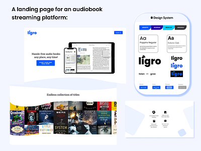
----------Color Scheme:------------
Blue calls to mind feelings of calmness or serenity. (assuring the user that every experience of this app is going to make them more relaxed)
Blue is often seen as a sign of stability and reliability.(User will get to trust the app and then subscribe)
I have specifically chosen an analogous color combination to make it more versatile for both light and dark environments. (meets AA web-standard)
---------------Typography:----------------
Don't want you to use too many fonts that might get the user confused.
Need to have the perfect mix of modern (for the large segment of the young audience) with classy to give that library feels.
Hence the main font will be Poppins. A font sans-serif family that ensures good readability on the web and is also modern.
As for the secondary font I wanted something that tells the users that they are not in a world that is far away from the books, they love dearly.
To convey this message subconsciously I had to use some font that they’ve seen a lot while reading printed books.
So the font Roboto Slab of the serif family was used as the secondary font. (Serif fonts dominate the printed media)