Stock'd Design System

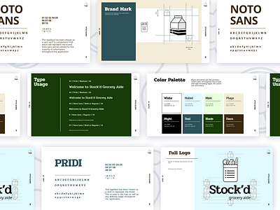
A clean and refreshing color palette was chosen to complement the predominantly white interface. These colors incorporate the grocery concept and represent freshness. The design system will be used to keep fluidity and consistency throughout all things Stock'd.