Google Pay Redesign Concept (Neumorphism + Flat Design)

Hey Dribbblers!
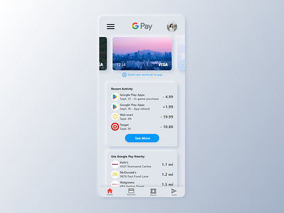
Here's another quick concept that fuses both neumorphism and flat design! This time around, neumorphism was mainly used to replace elements that were elevated in the current Google Pay build, so for this redesign, the only elements that incorporated neumorphism were the credit cards and info card elements. The bottom navigation, profile, menu, and "See More" button all retain their flat design aesthetic--subtle drop shadows are used to signal users that the element is interactive.
What do you guys think of it? Let me know in the comments below, and if you liked it, be sure to hit that "L"!
Want to collaborate or hire me? Contact me at theo.oing@gmail.com!