


Orlando City Concept

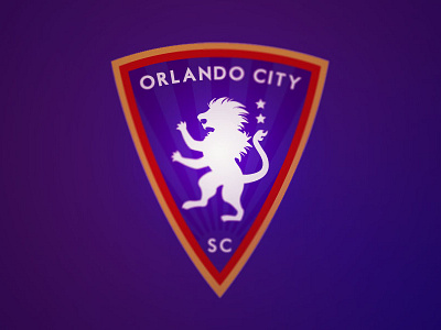
Decided to update Orlando City since they could use a refreshed look when they enter MLS in 2015. They have a good concept as it is, so I opted for an update instead of re-doing their design from scratch.
I went for a Real Zaragoza kind of look and made the shield slimmer. The two stars above the lion’s tail represent their two USL Pro titles (which can’t be represented with stars above the badge once they move up to MLS, but they’re still a part of their history). The rays behind the lion represent Orlando bringing The Sunshine State back into MLS.
Credit to Mohammed Rahman for the font (Motor Oil 1937). No commercial use intended.