Penlon Mobile Nav

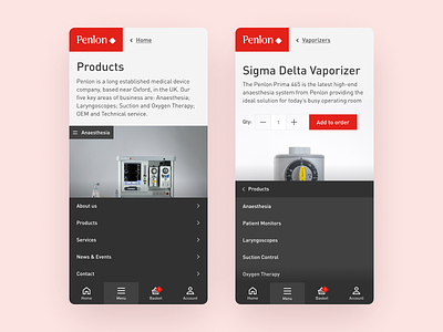
During the Penlon design I decided to adopt a new design pattern for the mobile navigation.
Mobile devices are getting bigger and bigger and the traditional menu at the top of the screen is no longer a user friendly option.
Instead I opted for a nav that you’re used to seeing in native apps, I capped the height of the menu so if it get’s too tall you simply scroll through it instead of having to stretch your thumb.
Created at Syndicut.
Need help with your project?
Get in touch 📮 hello@robsimpson.digital