PJ Kev Approved Branding Identity

The #PJKevApproved logo system for @pjkev was designed to showcase and represent the PJ Kev brand in a positive, professional and energetic light.
⠀
The goal for this project was to create a logo system that conveys professionalism, integrity and and a luxury brand feel. This logo system needed to be scalable to allow it to be applied anywhere and still look consistent and cohesive.
⠀
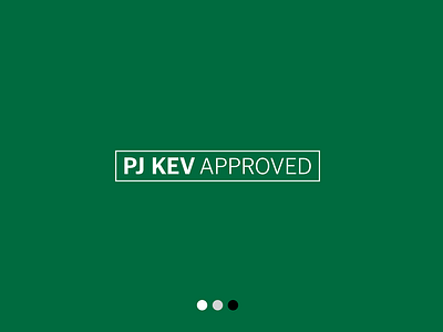
“Ghana Green” was the main color that was used in this color system to pay homage to Kev’s roots and to visually associate the brand with the feelings of energy, growth, freshness and ambition.
⠀
After finding a solution for the logo’s typeface, variations of the logo mark were created that gradually take up less space and become more simplified for scalability purposes.
⠀
This resulted in horizontal and stacked versions of the logo that were later used to create a pattern system and a combination design using a custom hashtag mark.
⠀
The pattern that was created works well as a subtle texture next to the other solid brand colors. It also works as a backdrop for events particularly well.
⠀
Overall, this logo family works well to convey the qualities of the brand as well as being simple, easily identifiable and appropriate.