Cultivate Logo Design

Cultivate was an independent research project created in order to connect marketers, designers, and developers in mentorship relationships. The goal of this project was to validate the likelihood of automating accurate mentorship pairings using data derived from experience, emotional intelligence, and areas of focus.
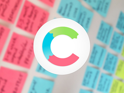
The cultivate logo is derived from a rule of three: three types of relationships, three levels of expertise, and three classifications of work. The colour palette is based upon the three colours found in standard packages of neon post-it notes. These foundational colours were appropriate as I found it spoke to the tactile brainstorming and collaboration in many creative processes. The organization of colours within the "C" letterform are also meant to symbolize the transfer of knowledge throughout a mentorship relationship. When done correctly, mentor-apprentice conversations should be balanced, non-hierarchical, 2-way conversations and both individuals should be learning. This cyclic graphic speaks to that knowledge transfer.
This project is currently being converted into an open-source document that helps designers, developers, and marketers approach mentorship. The full case study can be viewed here: http://www.toddsmith.tv/cultivate