


DailyUI #049 - Notifications

Good' afternoon Dribbblers 👋
This is my #049 #DailyUI design. 🔔🔔🔔
Design Hint 💻
No design hint today... 😔 Where are these disappearing off to? 😅
The Idea 💡
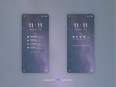
The idea for todays UI design is a mobile lock screen for Android, emphasising the notifications part of the UI. The screen will feature various lock screen elements such as the time, quick camera and a status bar. The design will be clean and modern, with a single UI colour depending on the current background (darker backgrounds = White & lighter backgrounds = Black), small but legible iconography and text, and a simple but thought-through layout.
Final Thoughts 🧠
It' modern, it's simple and it's super clean! Emphasising the notifications part of the UI today, I first wireframed the overall screen, iterated and then focused on the notifications design. The result, a beautiful lock screen that prominently displays the 4 most recent mobile notifications and displays the rest as miniature icons. The screen also has the bonus of having a location temperature underneath the time, always great to see!
The 'unhidden' screen design [LEFT] displays all the notifications in their full glory as a vertical list, with both iconography and text displaying in harmony. The user would first see the application name from which the notification is coming from, to the right of the title is a small timer text displaying when the notification initiated. Under the title is a short 'snippet' sentence to indicate what the notification is, and finally a large icon finishes off the notification, further giving some sense to what app the notification is originating from. Underneath the 4 most recent notifications, the 5th, 6th and 7th notification is displayed as small icons to give a sense of what further notifications the user has, and after that, if the user has even more notifications it simply displays as an '+' additional number, to display how many more the user has.
The 'hidden' screen design [RIGHT] displays the 4 most recent notifications in a horizontal list. The notifications on this design hide sensitive information from the user, this information being the title and snippet text from the previous screen. Each of these 4 notifications has a timer text underneath the icons to give a sense of when they initiated, but that is all. Along with a '+' additional number, to display how many more notifications the user has, again. Finishing off the notification list on this screen is a small simple sentence indicating that the notifications are indeed hidden and that the user would have to unlock the device's lock screen to view the sensitive notification information; simple, small instruction.
Overall, I think today's design has gone really well! It's super simple and minimal, displaying notifications in a really clean and easy-to-understand way. I like what I've designed!
Unsplash photo credits 📷
@jasperwilde
Share the love, press "L" or "F" if you ❤️ my work!
As always, I welcome any feedback! 😄
- Elliot