Homeblend Branding


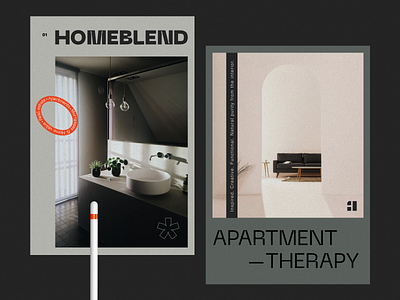


While working on branding for this service, we paid particular attention to the logo parts placement in such a way that they somehow interpreted the first capital letter of the naming — H.
So, working through this idea, we received a minimalistic logo, which interprets the first naming letter and the house 😎 🏘.
--
✅ Follow our team