


Gittip Logo

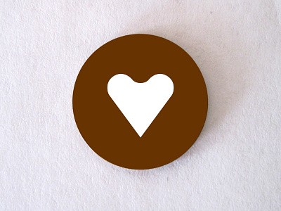


I am working on Gittip, a way to give money every week to people and teams you believe in. This is the Gittip logo, the "heart coin."
Gittip is gently turning the economy inside out, replacing greed and desperation with generosity and gratitude. To be adequate to this sweeping vision, the Gittip logo had to be iconic and direct, in the tradition of Rand's ABC and Janoff's Apple. Both heart and circle are elemental shapes, and combined into a coin they symbolize the reappropriation of money for humanistic ends that lies at the heart of Gittip.
The logo's heart shape was originally pointed in the top crevice. It evolved to its present form when I had tooling made to put hearts in real currency: the limitation of the CNC end mill dictated the rounding on the inside of the top of the shape. I tried hard to find a solution that preserved the original shape, but in the end I decided to change the logo itself to match the tooling I was able to get (I was also under a deadline for a conference). The result is this rounded heart shape, which, although it can become muddy at very small sizes, I now appreciate as being uniquely Gittip.
See the attachments for the application in metal. The portable Roper-Whitney press is a hit at conferences and meetups, where anyone is invited to punch out "the world's best and worst business cards," as I consider them. Real-life heart coins are memorable and delightful, but there's no contact information on them. I'm satisfied to send people on their way with a small impression of delight. The truly interested will connect with Gittip on their own terms.