Verizon Branding

What do you think about which one is best?
Which one creates more value?
We are waiting for your valuable critics.
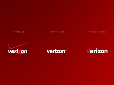
* Verizon's present Logo designed by Pentagram partner Michael Bierut. They are one of the best Design Solution Agency in NYC.
We love them. They are amazing.
* Now, What we did actually?
We are trying to create a simpler version of Verizon's Logo.
The new logo is "a cleaner, more human-centered design and the Check-mark is now in Verizon's letter "V",
It presents the Universal symbol for getting things done, uniquely expresses the reliability of Verizon.
The entire logo is as well as a simpler, straighter Helvetica.
And the newest version of Verizon is Bold, Clean, Memorable, Understandable, Usable, Scalable, Minimalist.
* We believe that these little changes of Verizon Identity give it a futuristic feel that's stand up to 50 or maybe 100 years long.
For Watching Full-Projects, please click this link: https://www.behance.net/gallery/84203245/verizon-redesign-concept