


Physicum - Logo design


Brand Identity for Physicum - personal training and physiotherapy studio 😄!
Physicum as a brand has a lot of competitors in their industry but they differentiate themselves by doing only 1 on 1 coaching.
The reason they wanted a new logo is because their old logo looks outdated and does not look like a high end and a professional brand.
They wanted their identity to be more recognisable,trustworthy and professional and to stand out from the crowd.
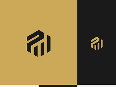
The problem was solved by creating an identity that looks more professional by having a mark that represents services by using abstract stripes (training ,treatment and coaching),improvement and also a letter P which stands for Physicum.
Hit that button if you enjoyed and make sure to save this post for later inspiration !