Rodwic Motorcycles

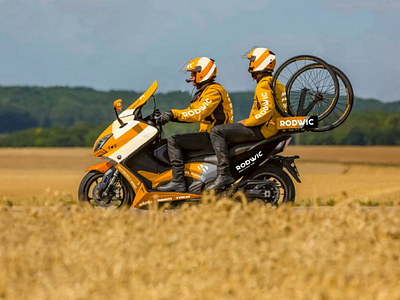
The different applications of Rodwic on cars , motorcycles, buses, bicycles and other objects are multiple, but allows the brand to better integrate and thus allows users to better project themselves through the mockups used. The brand's logo is positioned at the rear of the vehicle in large to show the perseverance, physical effort and a certain continuity of the logo. The name appears on the door as well as a reminder of the colour orange and grey, which is a good compromise. These oblique coloured stripes underline the curves of the vehicle and add movement and references to the "M" jamb. I also placed potential sponsors on the lower body to make it more realistic and credible. A few other small details such as social networks, the website, and the car number are all there to cap off the orange bikes of the racers. The bus takes this principle as well as the bike with which I made some modifications with the layout of the logo for example. The cyclist's jersey is an essential part of the communication of the sponsors and especially of the brand. These sportsmen are often filmed on the side or back, which is why the main sponsors and the brand appear in these two strategic communication places. As for the helmet, it includes the rider's name and race number to better identify him/her. The water bottles or "jerry cans" are very often collected by spectators and are therefore also a good brand support as well as a stand that provides a pleasant environment for interviews with cyclists. This logo with convictions and emotions fits perfectly on any support and reflects the intentions of the team participating in these sporting competitions.