Website Logo

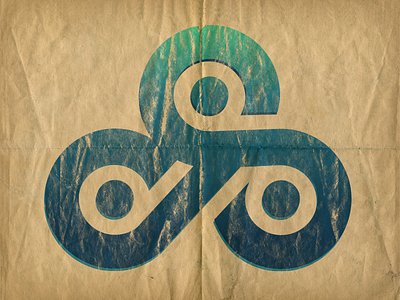
After getting my sketch into Illustrator and building it I realized what looked good in my Moleskine did not work on screen. After a lot of tweaking and modifying this is what I came up with. I'm pretty pleased with it as the design is still true to the concept, and addresses both goals of being both a readable lettermark as well as a pretty nice symbol.
I would love any feedback, thanks.