Maya Carvajal

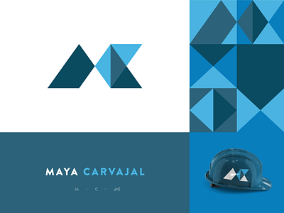
The letters M + C are represented by the brand symbol. I decided to use geometric forms because of the brand DNA, wich is sleek aesethic but also cheerful and constantly growing. The color palette represents severity, trust and loyality.