


GIF - City Identity Concept
Concept for my cities branding. My submission for the current logo contest.
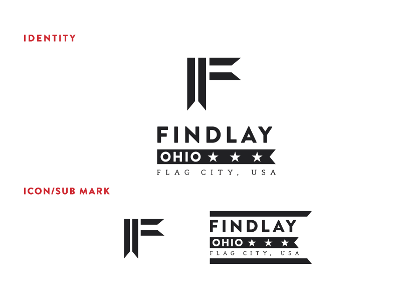
ICONIC: I wanted to develop an icon that could stand alone and visually tie in to the city. I designed the “Flag F” to stand alone and to be that icon for the city. The angles in the cuts of the flag were taken directly from the Ohio-State flag angles as well. I felt this too helped give the icon a stronger visual presence.
FLOW: Creating the iconic flag and utiliizing a strong typeface gives the overall mark a great visual flow and is quite impactful. Beyond that I felt the flag could be animated to wave just as a flag and push that flow beyond what the overall static mark is (Think videos/commericals etc).
UNIFIED: Again the visual hierarchy naturally creates a very unified/uniformed look. I wanted to push that further with color and chose to stick with the red, white & blue for obvious reason, but also wanted to incorporate other color stories to showcase the community unity. I also, felt that beyond the mark, the supporting imagery could visually showcase the unification of the city (farmland, local foods, and of course the root of us all, the American Flag, etc).
Feedback welcome.