Booking Lab Logo Design Concept 4 (4)

Concept 4 of 4 from my time working with Booking Lab!
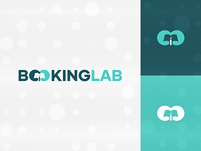
The last (of 4) concepts I'll be showcasing to you guys.
Although this concept is a little less legible compared to the other iterations I had worked on (particularly at a smaller size), I am a big fan of how I was able to incorporate elements of Booking Lab's name.
I overlapped two circular shapes to form the O's, and to define them further, created areas of negative space - which also created the form of an open book.
To add identifiers for Booking and Lab and bring the whole theme closer together, I created an accent colour and applied that to specific areas of the logo.
Thank you for viewing my work 💙
Want to work with me?
Drop me an email at contact@penna.design
Or visit my online portfolio here penna.design