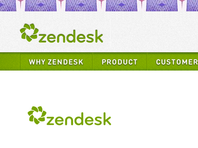
Zendesk Nav To Airy
I finally bullied @Toke Nygaard into making the top navigation spacious and white. Of course, it wasn't an easy decision because this move had wide implications across the site - the green bar provided a really easy division between the top nav and the rest of the page. But on further exploration we realized nothing calamitous would befall the UI, and the whitespace freed in the process was actually more in line with Creative's "airy" ethos.
Posted on
Oct 10, 2013
More by Ross Chapman View profile
Like


