Yalls Vodka

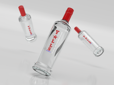
I tried to keep this one simple and I think that it came out clean. The name is typed vertically with a star replacing the "A", but altered to resemble an "A" beyond what it already does. I then chose to use a cursive font for the motto going up the side as I find that to be typical of the South (maybe y'all don't agree, I don't know but it makes sense to me). I also chose to make the colors of the types mirror that of the North Carolina flag if it was rotated -90 degrees- blue on the bottom, red on the left, and white on the right.