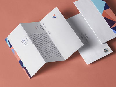
Repli Brand Identity: Letterhead

Repli was created to revolutionize an industry and take it out of its comfort zone through selling copiers-as-a-service.
Customers have grown accustomed to the push-button world of Amazon and online retail. Repli sought to upend the business model in this space by bringing curated and fun customer experience to the everyday world of office equipment leasing. The founders needed a standout brand, company naming, messaging strategy and digital to go to market in a few months.
Because it is essentially a new product (or pricing structure) attempting to disrupt an existing market through creating a niche, we placed the focus on how the product is better and different than incumbents. We landed on an origami symbol to represent paper and the name “Repli” which is derived from (the concept of) replication.
The color palette, illustration style, and secondary elements all strike a modern contrast to the stale industry of office equipment. On the messaging side, we emphasized the key differences from the competition: No salesmen, no strings attached and a quick and easy path to purchase.