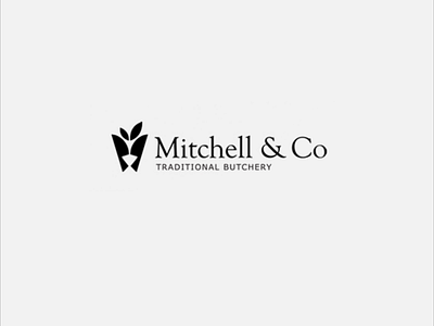
Mitchell & Co brand identity
Mitchell and Co's identity comprises two stylised butcher knives facing each other to form a crown like shape symbolising the superior, high quality meat and service provided by Mitchell & Co. The leaf shapes on top reflect the fresh, nutritious and organic products offered.
The main typeface chosen was Goudy Old Style, which conveys a classic yet modern feel and complements the logo mark nicely.
View all tags
Posted on
Jun 28, 2020
More by Jeremy Laycock View profile
Like

