Sem Thomasson Logo Scrap 3

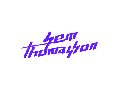
First digitization with slight adjustments. Dislike: dancing letters and baseline + double-s still reminds me a bit too much of the German SS. Like: hand-written, irregular feel and robustness of the letters.
First digitization with slight adjustments. Dislike: dancing letters and baseline + double-s still reminds me a bit too much of the German SS. Like: hand-written, irregular feel and robustness of the letters.