YNYS | Tea Visual Identity

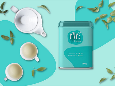
This project was thought and elaborated to be a fun, light and relaxed brand; its conception took place in order to reach the market with subtle flavors. The name Ynys, comes from Welsh and means “Island"; the symbol refers to an island seen from above with its contour lines and, at the same time, to the tea mixing in water; the typographic part was designed to convey the fun and relaxation of the brand, and the colors refer in a curious way to the flavors of the tea.