Besito

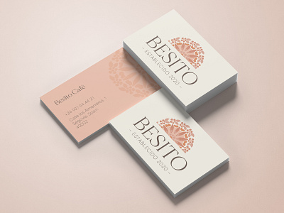
Besito translates to “little kiss” — a play on words on the action of taking a sip of coffee. This branding project draws from Spanish culture — the color of terracotta tiles and the beautiful painted plates — to create a cute and trendy café. The emblem of the logo continues into a pattern design that is featured on the menu and peaks out on the business cards. The color palette challenges the values that are most commonly used for Spanish branding and aims to create an uplifting and airy feel while embracing the same roots.