Le O Donut Shop logo design

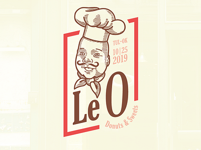
"The O," a french dessert shop. Not really. . I wanted to play around with a @petervoth style vector etching. So I drew my little baby boy, Leo. Then one thing led to another and now I have a logo for a french donut shop. Le O. . To be honest, I really kinda gave up on the etching thing. I started on the iPad as a sketch with plans to rebuild with perfect lines in Illustrator. But then I sat on it forever and ultimately just thought, F-it let's get something done. Didn't have the patience to rebuild it perfect. . I customized the O quite a bit. When you enlarge type unevenly (the O is much bigger than Le) it creates imbalanced strokes. After I scaled the O up, it was much more thick and dense. So I thinned it out a bit to feel like it was drawn with the same "stroke." . Pretty happy with this considering this vintage style isn't really my expertise.