Brasilis | Chocolate Visual Identity

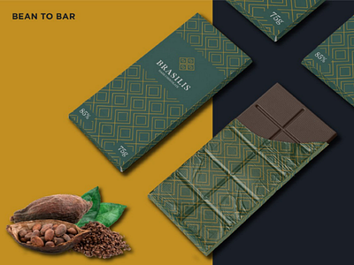
This project was thought and designed to be an elegant, strong and Brazilian brand; its conception took place in order to reach the international market with Brazilian flavors. The symbol refers to the artisan chocolate segment, Bean to Bar; the typographic logo is designed to convey the elegance of the product, and the fluidity and precision of manufacturing. The colors refer to Brazil's Flag.