Spejl Blank - Landing page

In addition to designing the flow of Spejl Blank's new subscription product (window cleaning on subscription), I also helped to redesign their landing page to reflect the introduction of the new product.
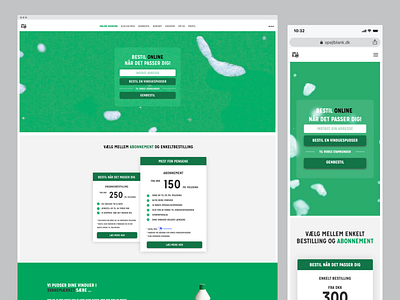
While redesigning the landing page, I also focused on optimizing the page for a better conversion rate. Among other things, we decided to add the "Order online" flow to the front page, above the fold, in a blurred box with floating foam in the background for extra attention. By doing so, we were able to save one click in the user journey to achieve a better UX and higher conversion.
Watch the landing page live on www.spejlblank.dk.
Cheers!
/Rasmus