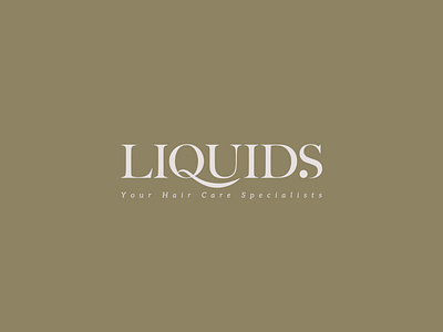
Liquids
Liquids is a hair care specialist originated from Sabah. The word mark design is a modification from the font Big Caslon Medium. The curved line that extends from the letter Q represents wavy hair. As the target audience consists mainly females, we have added a feminine and elegant touch to the logo.
Art Direction & Design: Ideology
Client: Liquids
Location: Sabah
art direction
brand
brand design
brand identity
branding
design
graphic design
hair care
identity design
logo
logodesign
logo design
visual identity
wordmark logo
wordmarks
View all tags
Posted on
Jun 14, 2020
More by Ideology Design Studio View profile
Like

