Qwave, Sail away

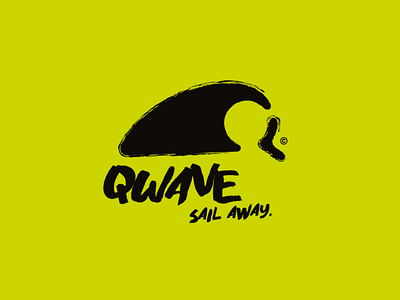
QWAVE is a new project of an innovative surf brand for the quality of its materials used for its boards. I realized a logo different from what I usually do but I loved the result. So I was inspired by the existing surf logos and I could see that they gave off a feeling of freedom, of surpassing oneself and of extreme experience. I made an irregular logo representing a surfer surfing a huge wave for the extreme aspect and referring to the gigantic wave of some regions popular by sportsmen. In addition to this, we notice in negative space the letter Q, reference to the name. The whole is deliberately bent for the ride spirit which is very urban (tag and sticker) as well as for his freedom (as if someone were making stencils on a walland that it had overflowed). So I transcribed all these aspects into this powerful and understandable logo. Moreover the slogan intensifies the adventure side as well as the fact of detaching from all that surrounds us to concentrate on one thing: surfing