Icons for Features Page

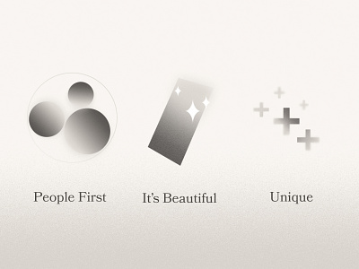
Designed for the Techless.com/kidsos-features page. Since this page had lots of content, the idea was to restructure it and break it up into 3 groups. The first section talks about how Techless is people-centric. The spheres here represent people or family. Techless technology will bring break us free from the restraints of addictive technology in order to free us to build meaningful relationships. The second section discusses the elegant design of the user interface and why it's so much better than alternatives. This illustration is perhaps the most literal of the bunch. And last, these plus signs emphasize the added benefits of Techless, that sets its experience apart from similar services.