
Pocket 7


As we embarked on this redesign for Pocket 7, code-named Project La Croix* (because it’s refreshing 😉), we set some ambitious goals.
___
Goal #1: Create Pocket's Design Principles
Design principles are beliefs that will inform our future decisions. At a micro level, they help our design team compare solutions. At a macro level, they ensure that users’ needs are a priority.
1. Consistent so I only have to learn once
We are cross-platform, so the transition between devices should not require new learning.
2. Crafted with care, and confident about the quality
Similar to a nice restaurant, we want our users to feel taken care of.
3. Accessible to all users, so everyone feels welcome
Our product is dependent on typography and color that should enable readability and accessibility for all.
4. Respectful of content, so it helps me focus on what matters
Content creators craft great stories, titles, and artwork. Let's not mess with their work.
5. Calming so I can escape the noise of the Internet
We should be more like your local library or reading nook. Simple, relaxing, and consistent.
6. Provide smart defaults and the right tools when I need
Old products are often bloated. Let's expose only the best features.
7. A reflection of me and my interests
Pocket is a place for new skills, hobbies, and personal investments. Be a safe place for our users to grow.
___
Goal #2: Refresh our entire product experience
No stone was left unturned. We touched up everything from the on-boarding illustrations and iconography to color and type.
Illustrations
As we considered the evolution of the Pocket brand, we sought out illustrators who have a human touch and a sense of fun.
We worked with an illustrator, Miguel Angel Camprubi, to develop illustrations that are flat and playful — drawn by hand and with a sense of humor. His illustrations feature relatable, whimsical characters who do funny things with Pocket.
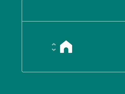
Iconography
We wanted unique icons, but we didn’t want them to compete with content. So we developed a style inspired by the Pocket logo. Bubbly round corners and thick lines. They are expressive but not the focus.
Our icons easily guide you through our experience without distraction.
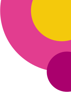
Color
Pocket has never shied away from using bold colors. Mint green, teal, coral, and amber are bright and have become iconic in our rainbow bar. Color has allowed us to differentiate.
We added dark teal, cyan blue, and suite of monochromatic friends, or shades. The new levels of color help evoke visual tranquility and relaxation.
Typography
Typography is the primary form of content you interact with on Pocket, so we decided to treat it as a first-class UI component.
We felt so strongly about our type that we gave it a dedicated medium post.
___
Goal #3: Increase weekly active readers
Our ultimate goal at Pocket is to help readers, read more.
A significant risk of changing UI is the possibility of pushing away existing users. We wanted to attract new users with a modern look, but also excite our dedicated user to stick around. Our real measure of success will be when the new look and feel helps existing users read, watch, or listen more.
___
Goal #4: Stop the baby duck syndrome
Newborn baby ducks who leave the nest early instinctively bond with the first moving object they see. A similar thing happens to people and the products they use.
Users bond with the first version. They learn to use the product a certain way, and it can be difficult to change their behavior. Products can combat this if they create a dialog of ongoing change with their users. Pocket’s visual refresh is the start of this communication.