


OMEG logo design

Oklahoma Medical Eye Group
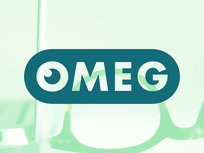
To me, the best logos start with Type. I'm pretty happy with this redo for the Oklahoma Medical Eye Group.
I should've time-lapsed this one because it would have been perfect to describe my process. Should I start doing that?
The quick and dirty of it:
The "eye" is just a Futura O--using the DNA of typography.
The twinkle is just the counter (the hole) of the O duplicated and reduced 50%--Contrast and type DNA again.
I chose to make 2 variations because the white filled version doesn't work. The pupil and twinkly look more like a crescent moon or something--Figure/ground relationship AKA Gestalt.
I didn't start with a grid on this one (I usually don't). But I used one to tie all the near alignments together. The twinkle's placement isn't arbitrary (although it started that way). It lines up with the arm of the E and the stroke of the O--Wholeness.