KEH2 Logo Design Rebrand

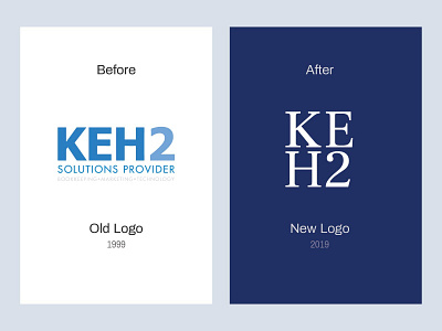
KEH2 offers custom bookkeeping, technology, and marketing solutions for small businesses in the Greater Boston area. They used their old logo for more than two decades before deciding it needed a rebrand to avoid a common mispronunciation of clients calling them "ke - two" instead of recognizing the acronym. The new logo helps correct this issue by breaking the mark into separate levels which decreases misperceptions.
To see the full project and rebrand of the brand identity and website, check out our case study: https://www.cg.digital/work/keh2