Blogger profile card - This or that?

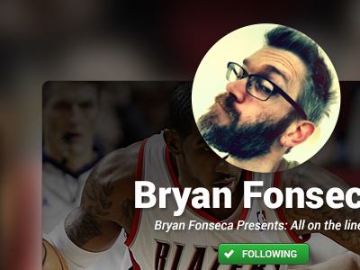
Playing with a couple different directions for the blogger profile screen. See attachment for both options.
Back and forth between something for simple and streamlined or more image-heavy. Is the one on the right just too overdone?
Appreciate any feedback.