


Google GCS Product

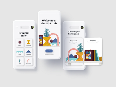
I was required to help create the visuals for the new Google GCS hub site. This ranged from the new look and feel to the iconography and type choice.
I was instructed that we didn't have to adhere to Google's current guidelines and we were allowed to play with colour and font choices to match the feeling of Googles Redwood office.
The client wanted it to have a 'west end' feel to tie in with the office. The abstract shapes were used to create an identity for each hub that could be carried through from the homepage to iconography and banners for the site.
This concept was veto-ed in the end - but I was still proud of it - so had to post anyway :)
Hope you enjoy