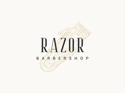
Razor

1 Hour Logo Challenge #12 Razor
Having to design a logo for a barbershop that offers high-end, premium services for men this time, I approached the challenge in a slightly different way. Instead of the concept creativity, I was more focused on getting the logo to feel right with the one hour that I had – I needed to make it look high-end.
When Hitesh said that he appreciated my choice of typeface as it adopted the characteristics of a razor and that the design looked premium for him, it sounded like music to my ears because those were exactly what I was going for 🤓
His only feedback would be for the "Barbershop" to be shorter in length compared to "Razor" for a greater contrast in hierarchy. He also mentioned another idea for the O to imitate the razor blade itself.
What do you think? Anyway, hope you like this work of mine as much as I enjoyed designing it 👩💻