Dropdown Signup Process Redesign

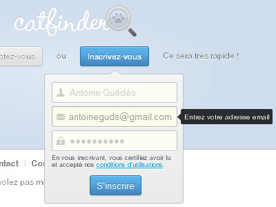
Following @Jean-Marc Denis's comment, I decided to update my latest shot, and add it some more contrasts. I feel like it's much better now. What do you think about?
Big thanks Jean-Marc! (if you read me) :}
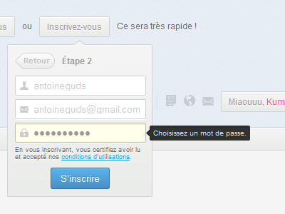
Following @Jean-Marc Denis's comment, I decided to update my latest shot, and add it some more contrasts. I feel like it's much better now. What do you think about?
Big thanks Jean-Marc! (if you read me) :}