TopSpeedManagement Logo Redesign

This is a redesign of my friend's sports management company, TopSpeedManagement. The logo was designed about 7 years ago and hasn't had an update until now.
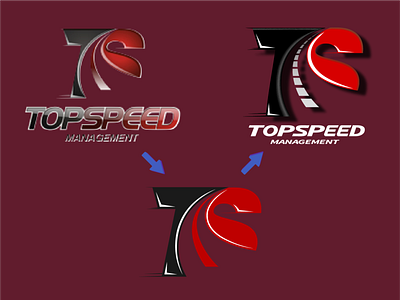
I wanted to keep a lot of the same design since it's already made a name for itself. The original depicts a 'T' and an 'S' with a line in the middle that resembles the centerline in a road. I kept that same design but made the line more noticeable, realistic, and separate from the other objects.
I was going to go with a simple and flat logo at first but we found the 3D effect was still usable for the logo but I did still remove the shiny gloss on the logo and title.
The final logo can now be seen on the company website, topspeedmanagement.com.