PlenDo
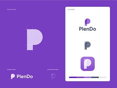
It's an app logo that features brand initial 'P' in a simple but creative way. The upper half of the P is heavier because it imitates 'D' of Do. So basically, both initials P and D can be seen in one place. How do you see it?
------------------------
Press “L” to show some ❤️
Are you looking for a logo (re)design for your business?
I’d be happy to hear your story! Feel free to reach out!
alternative mark
brand identity
branding
colors
identity
letter branding
letter logos
logo
logodesign
logo design
logo mark
logotype
marketing
minimal
minimla
modern
plendo
purple logo
vector
vector illustration
View all tags
Posted on
May 11, 2020
More by FullStop View profile
Like

