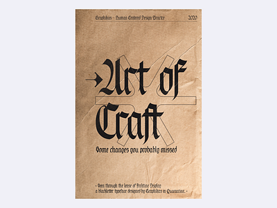
Craft of Fraktine


"What if" are the kind of questions that drives us forward and nuts at the same time. Exploring is part of the job, but when to stop?
So here are some explanations as to the recent changes I did but probably got under the radar.
The first one is the 'p', this one bothered me a lot when the solution was actually right under my nose - as it often is.
The second is a balancing of the T and the E. At lower points, it created weird zones I needed to get rid of, so I made those strokes more sturdy and reduced the finishing hairline.
I also wanted to try out something with the K, and I kinda like so there are now 4 'k's in the typeface. Swap 'em as you need 'em
The last slide is a little vidz explaining how I got to those symbol glyphs that are highly geometrical, yet still coming from the same nib. I like how it brings contrast and offers more legibility. I hope you do too.
That's all, thanks for watching folks, and have a good one!
-
Don't forget to press "L" if you enjoyed it!
-
For collab & inquiries: lucas@graphikas.design