Logo Design

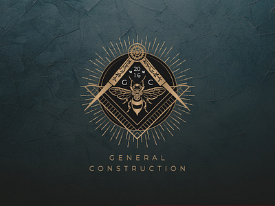
Logo/emblem design for a construction company. A very interesting order for me. The client insisted on the symbolism of freemasons. Therefore, having sorted through many symbols, including Masonic ones. Compass and square were chosen as tools of architects, the black sun as knowledge, a mechanical bee as industriousness, mechanisms, movement. The logo includes the initial letters of the company name and date of the foundation of the company. To emphasize the sophistication and elitism, which was started as a separate requirement in the brief, a golden gradient was chosen for the logo. The gradient has an adapted Panton color for easy printing.